
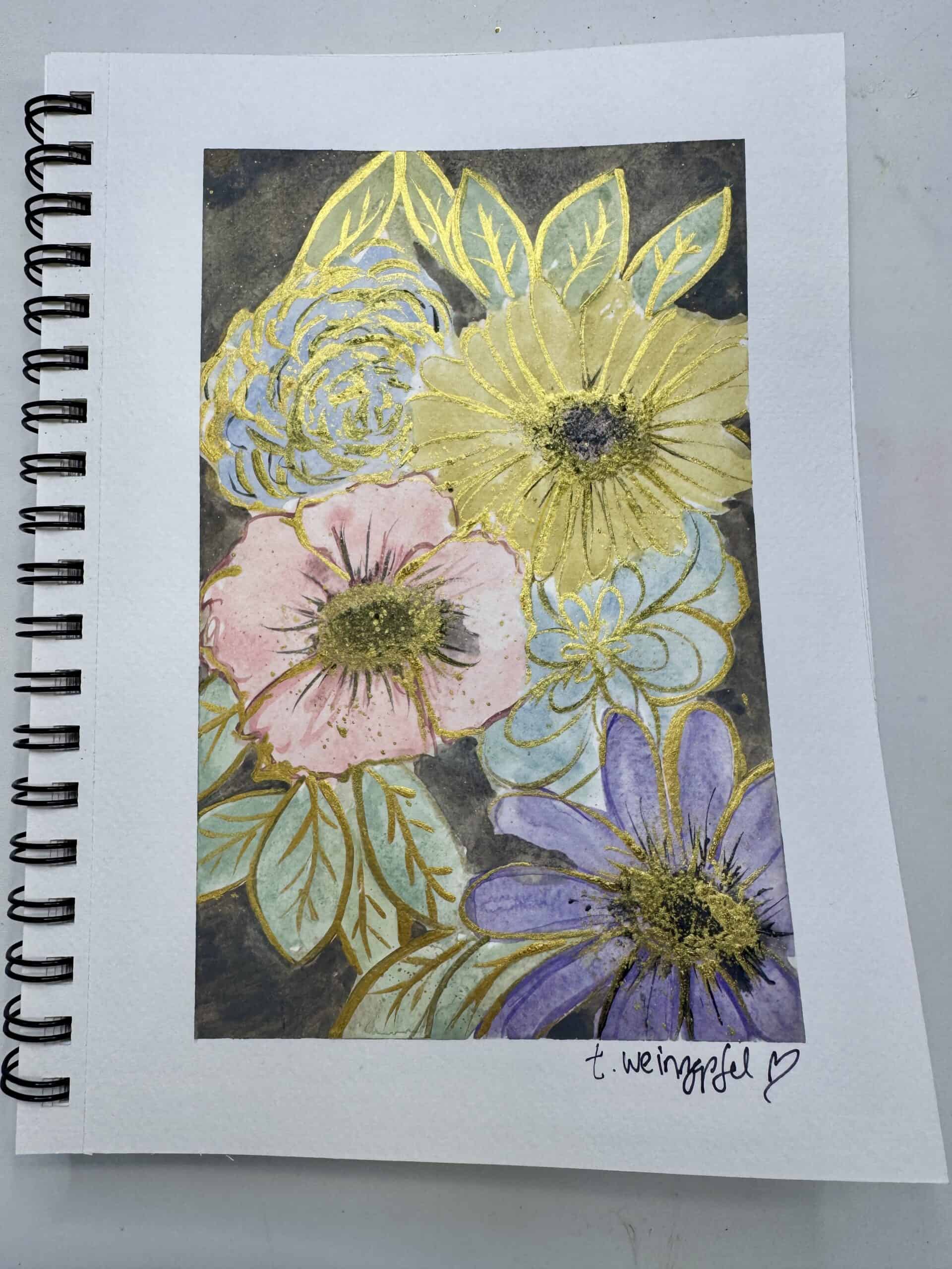
This watercolor floral page has a bold, layered floral composition with a dramatic dark background, luminous gold detailing, and rich Payne’s Gray accents. This project is perfect for anyone who feels intimidated by watercolor because it proves you don’t need control – you just need courage to start. Let’s walk through how this piece came together!
Begin by taping off the edges of your art journal page with painter’s tape. Mist your watercolor palette with water to activate the colors.
Load your brush with one of your pastel watercolor shades and begin placing rounded, organic shapes onto the page. Add a variety of soft tones such as muted pinks, dusty purples, gentle blues, and light greens. Let the water move the pigment freely. Some shapes will begin to resemble flowers. Others may look abstract at first. Continue building the composition without overthinking placement.
While the paint is still damp, drop darker tones, such as charcoal or a deeper pastel shade, into the centers of your blobs to create depth.
Use the tip of your brush to gently pull pigment outward, suggesting petal shapes without outlining them. Allow the water to soften edges and blend transitions naturally. If an area feels empty, add another bloom. If something feels crowded, balance it with leaves or lighter color nearby. Let the page dry completely before moving forward.

Switch to a small round or liner brush. Revisit each flower and leaf, intensifying areas by adding slightly darker versions of the original colors.
Define petal edges, add veins to leaves, and darken flower centers. If you need more contrast, mix in Payne’s Gray to deepen the tone. Apply details selectively to avoid overworking the piece. Focus on creating dimension rather than outlining everything uniformly.
Mix 24 Karat Gold Extreme Sheen acrylic paint with a small amount of Payne’s Gray. Using a liner brush, begin outlining petals and leaves with confident strokes. The gold will sit beautifully on top of the watercolor and create luminous contrast.
Add gold detailing inside the flowers as well, especially around the centers. This creates texture and visual interest. Use a stencil brush to add texture to the flower centers with the Payne’s Gray and gold.
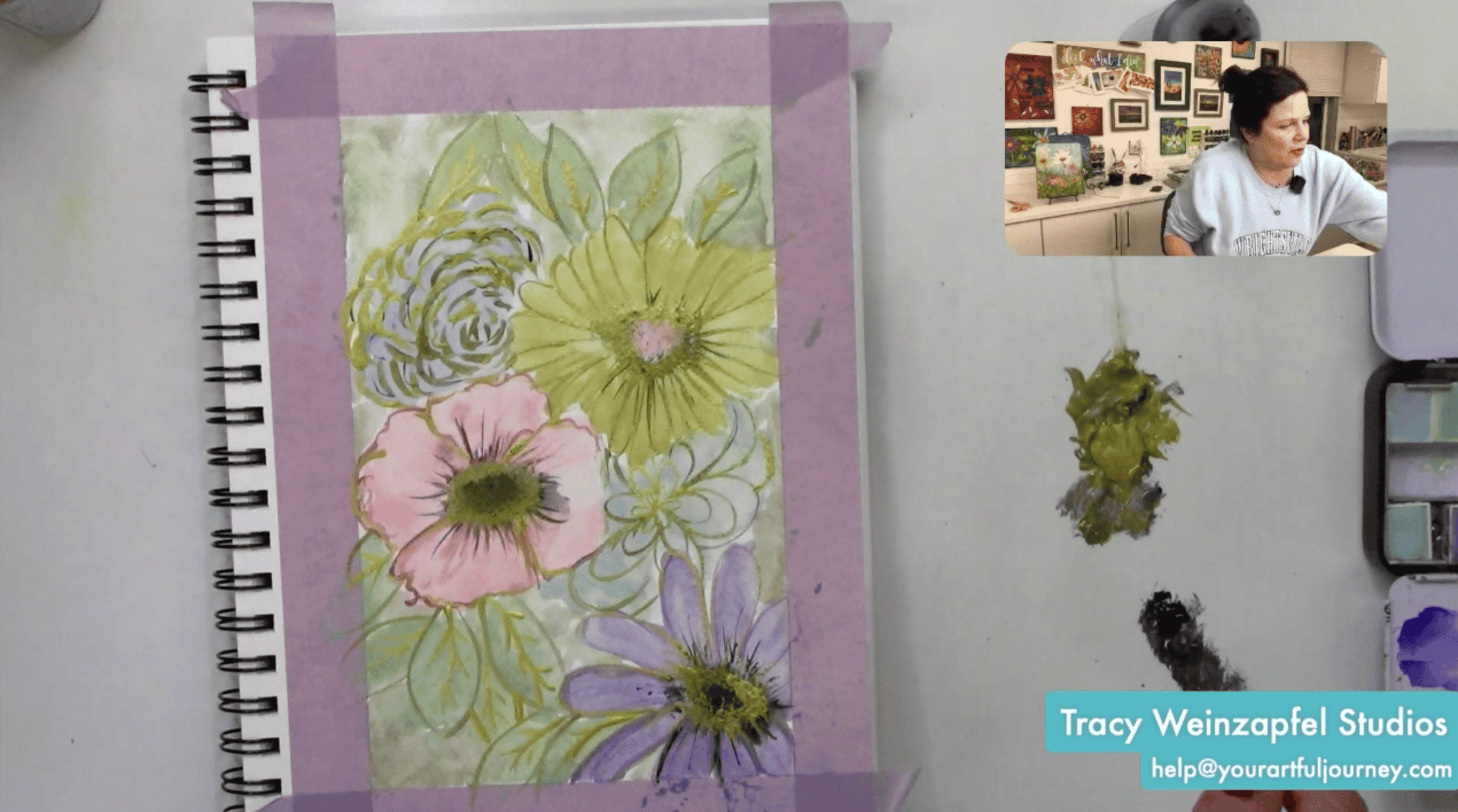
Using a larger brush and a dark gray watercolor tone, carefully paint around the flowers and full in the negative space. This step will allow the pastel flowers and metallic details to stand out dramatically. Let the background dry fully.
Using archival ink (such as Hickory Smoke), gently blend around the taped border with a blending brush. Apply ink lightly at first, then deepen as desired to create a subtle vignette effect.
Dilute a small amount of gold paint with water and lightly splatter across the page with a fan brush. Use controlled flicks to create fine droplets.
If your artwork will remain in a journal, apply a thin layer of Dorland’s Wax to seal the surface. Rub a small amount of wax onto the page and buff gently with a soft cloth. Be aware that wax will slightly flatten texture and resist future paint layers, so only seal when you are fully finished.
Carefully peel away the painter’s tape to reveal clean, crisp borders!
Watch the replay below!
Thank you for joining in on the creative fun. Join us LIVE every Wednesday at 5:30 pm PST on Facebook at Tracy Weinzapfel Studios.
Join the waitlist for Your Artful Journey! This is my exclusive creative membership where you can explore the world of art journaling! Join a community of support and inspiration with interactive art sessions full of tips and tricks, conversation, Q & As, and most of all, FUN!
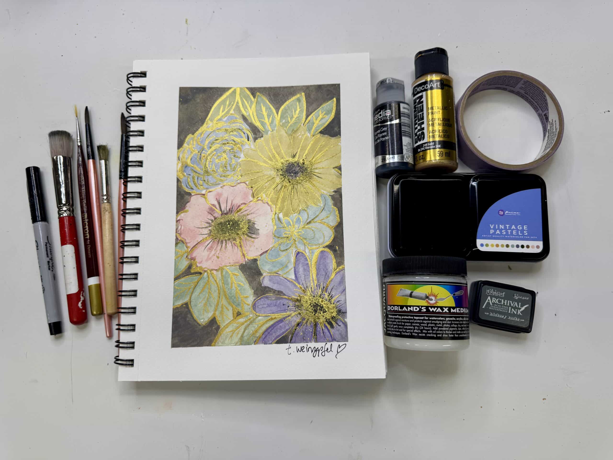
Supply List:
- Fabriano or Grumbacher 7 X 10 Watercolor Journal
- Painter’s Tape
- Watercolors: Vintage Pastels
- Decoart Acrylic Paints: Extreme Sheen 24k Gold
- Decoart Acrylic Paint: Paynes Grey
- Brushes: Tracy Weinzapfel Sets
- Liner Brush: Micron 10/0 X Long Liner Brush
- Ink: Archival Ink: Hickory smoke
- Sealer: Dorland’s Wax
Check out Tracy’s Art Journal Starter Kit!
Tracy’s Resources Page and visit Tracy’s Shop