
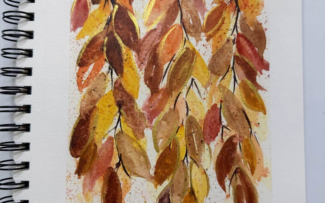
For this art journal project, I wanted to capture that fall feeling with loose watercolor leaves, delicate hanging branches, and touches of metallic gold. I imagined lying in the grass, looking up at tree branches filled with colorful autumn leaves gently hanging overhead. This is a wonderful project for practicing loose watercolor techniques, experimenting with color, and letting go of the need to make every leaf perfect.

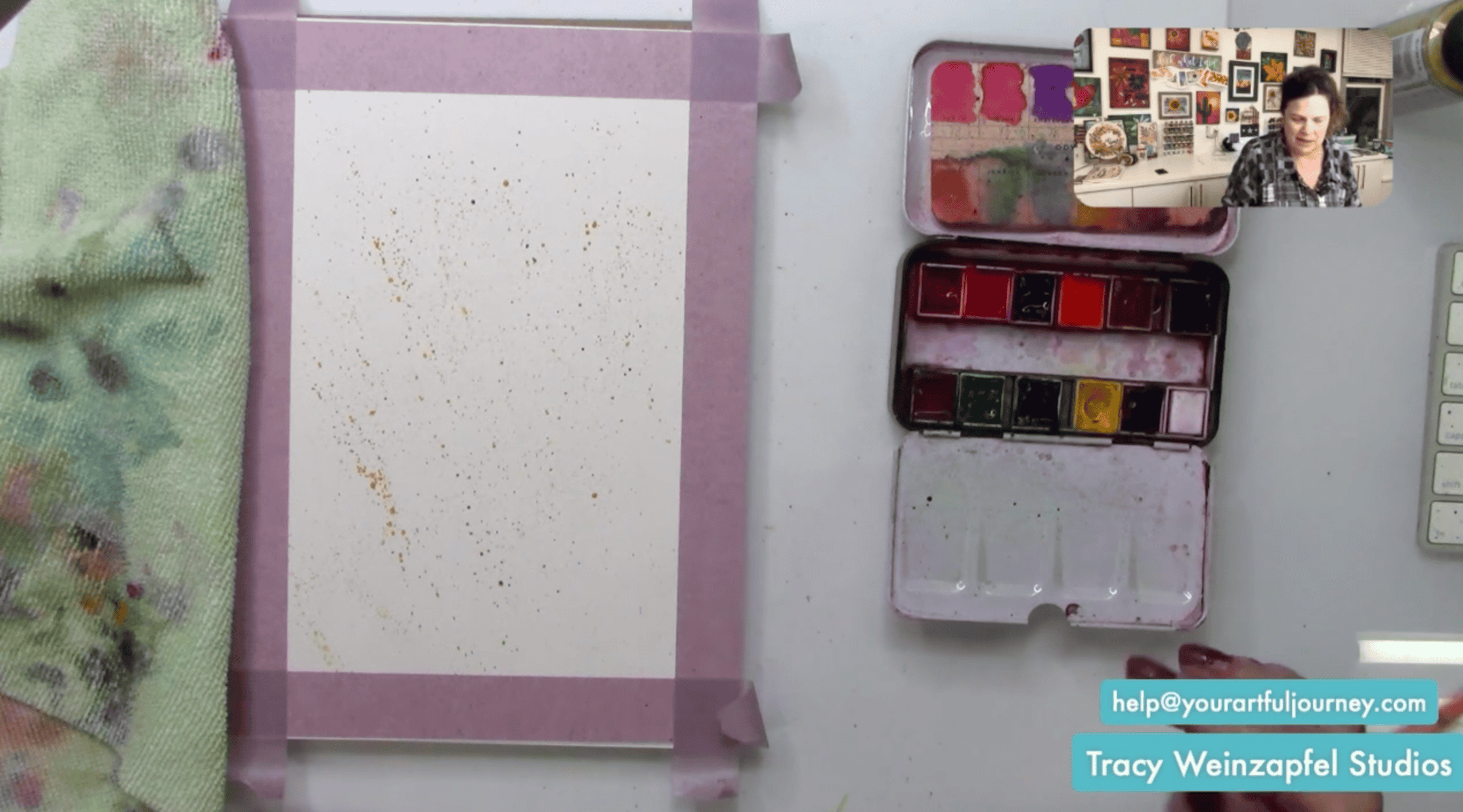
Prep your art journal page by taping off the edges with painter’s tape. Mist your watercolor palette with water to activate the colors.
For this project, I wanted to keep things loose and spontaneous, so I decided to skip the pencil sketch entirely. I had an idea in my head of looking up through hanging branches filled with fall leaves, and I wanted to see if I could bring that vision to life using just my paintbrush.
I started by reaching for my Odyssey watercolor set and picking up a beautiful yellow shade called Inca. Using a fan brush, I added some yellow watercolor splatter across the page. This first layer creates a soft, colorful foundation for the leaves we’ll be painting. I wanted little hints of yellow peeking through the finished artwork, so I kept the application loose and scattered. You can add more or less splatter depending on how much texture you want. Don’t worry if the paint lands somewhere unexpected. That’s part of the beauty of working with watercolor!
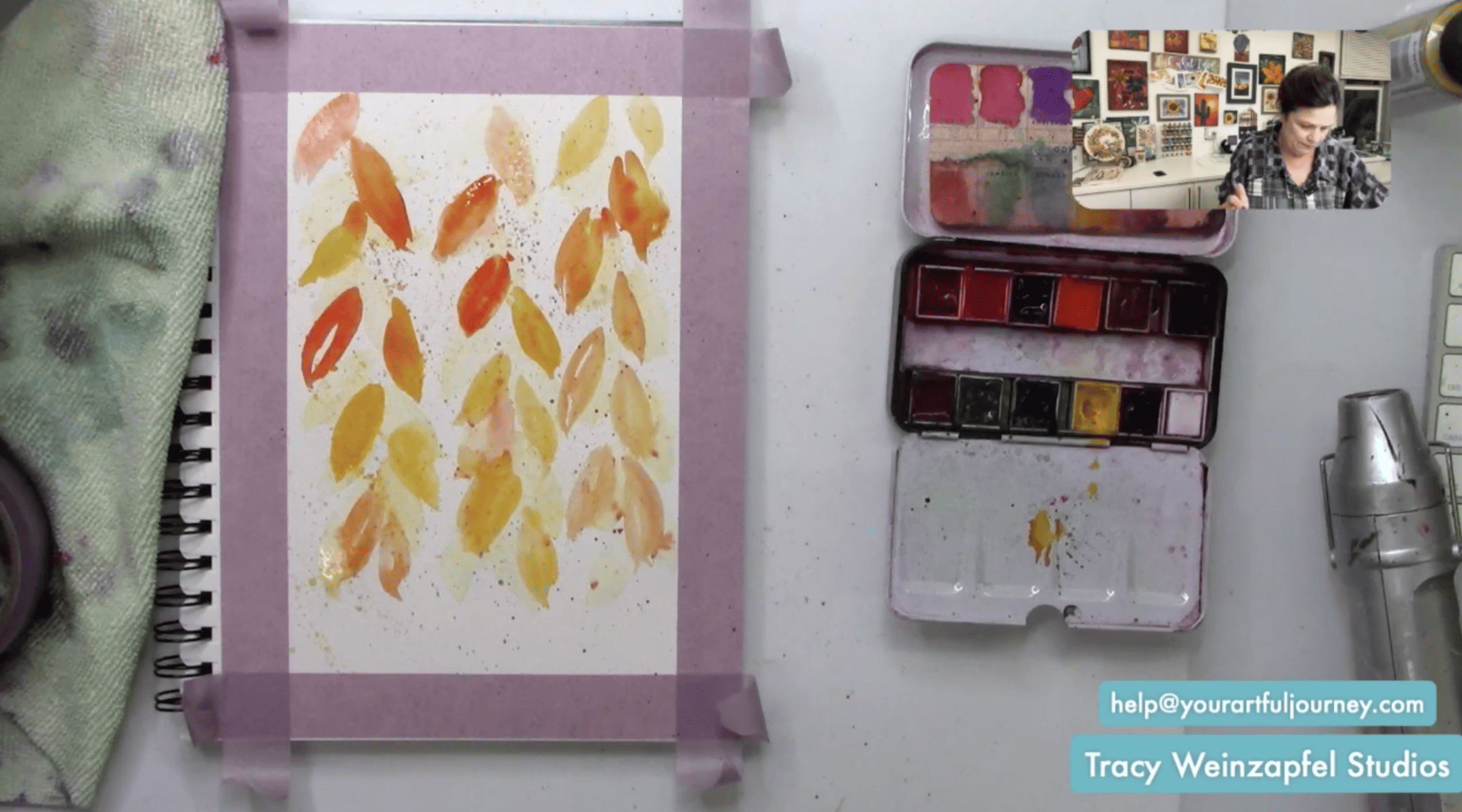
Next, I grabbed a round brush, approximately a size 6, and started painting loose leaf shapes directly onto the paper.
I painted elongated leaves in different directions, allowing some to overlap and others to stand on their own. I started with lighter yellow watercolor because I knew I would be building additional colors on top. Don’t worry if these first leaves look a little pale. Starting light gives you room to add depth and richness as you continue painting.
Once I had some yellow on the page, I started introducing orange watercolor. I added a little orange splatter with my fan brush and began painting more leaves throughout the composition. I tried to let the yellow dry a little before adding too much orange because I didn’t want to lose all that beautiful brightness. Of course, some of the colors blended together anyway, and I loved the effect!
That’s one of my favorite things about watercolor. The colors naturally move and mix, creating variations that would be difficult to achieve if we tried to control every little detail. Continue adding orange leaves in different sizes and directions, letting them overlap some of the yellow shapes.
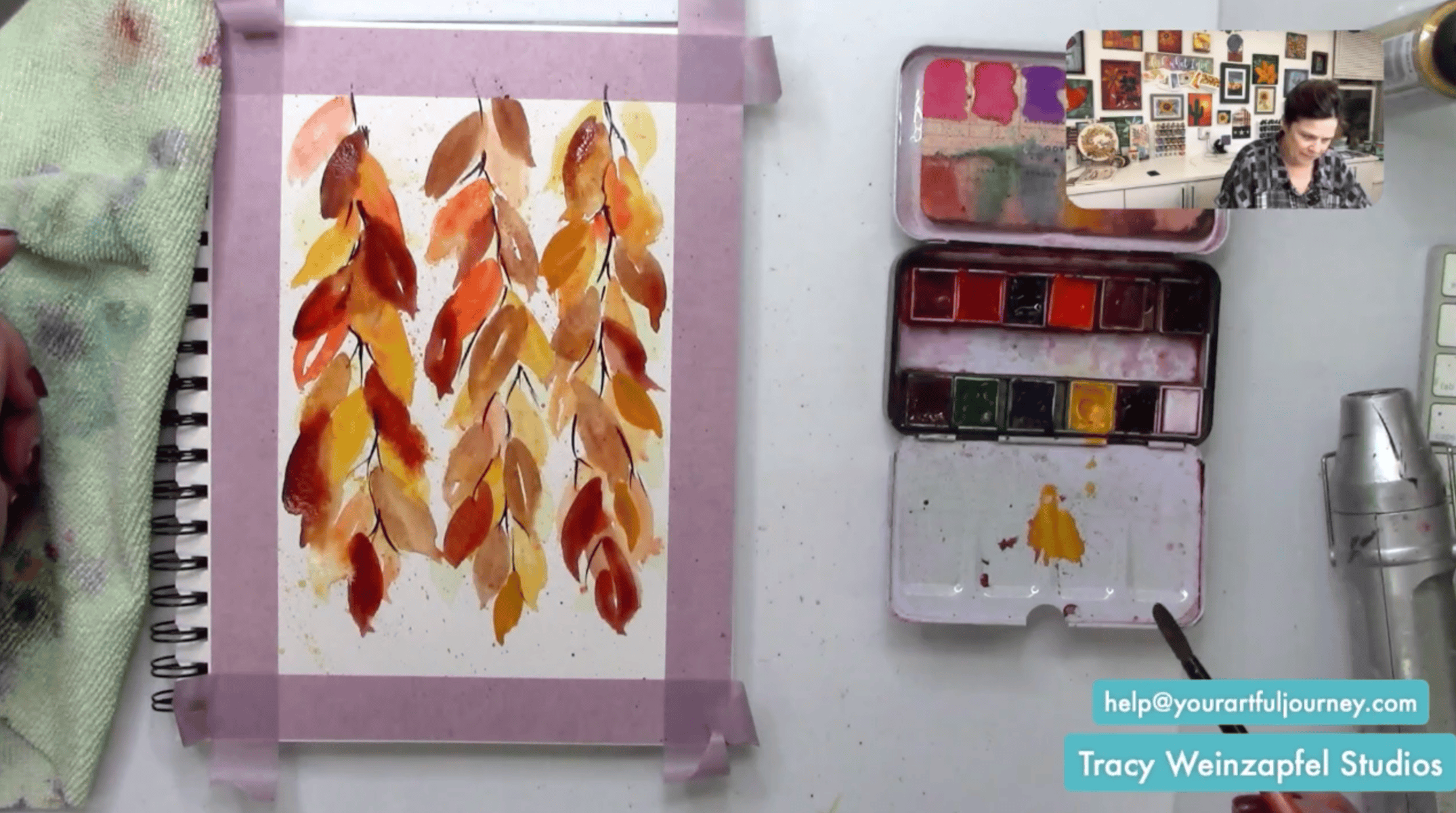
With the yellow and orange layers in place, I decided the painting needed some richer, earthier colors. I dipped into several brown shades from my watercolor palette and began adding darker leaves throughout the page. Some were warm and golden, while others had deeper, almost reddish-brown tones.
I gradually increased the intensity of the colors as I worked, allowing some leaves to become much darker than others. This is where the painting really started to take on that beautiful autumn feeling. The combination of light yellow, bright orange, and rich brown created a wonderful mix of fall foliage.
Once I had a good collection of leaves, it was time to connect everything with branches. I switched to a thin liner brush and picked up a darker watercolor shade. Using loose, delicate strokes, I began painting stems and branches that connected the leaves and gave the composition some structure.
Because liner brushes don’t hold a lot of water, you may need to wet your brush frequently to keep the paint flowing smoothly. I wanted the branches to look as though they were hanging down from a tree overhead, so I allowed the stems to curve naturally through the leaves.
Now for one of my favorite parts! I reached for DecoArt Extreme Sheen Metallic Gold acrylic paint and started adding little touches of gold along some of the leaves.
Because portions of the watercolor were still wet, the acrylic paint interacted with the surface in an interesting way. The gold slightly displaced some of the watercolor, creating beautiful little variations and textures. I especially loved adding gold along the edges of the leaves. It gave them a subtle shimmer without overpowering all those gorgeous autumn colors.
At this point, I decided to try something a little different. I grabbed a spray bottle filled with rubbing alcohol and lightly spritzed the watercolor painting to see what would happen. The alcohol disturbed the wet watercolor, creating interesting spots, lighter areas, and organic textures throughout the leaves and background. This is such a fun technique to experiment with because the results can be unpredictable. The effect will depend on how wet your paint is, how much alcohol you apply, and the colors you’re using.
Start with a light spritz and see what happens before adding more. Work in a ventilated area, keep alcohol away from heat and flames, and allow it to evaporate completely before using a heat tool. I loved how this little experiment added even more character to the painting.
I knew I wanted a little red in this painting, so I reached for a red watercolor from my Classics set. Rather than using a really bright, bold red, I mixed in a little brown to create a more muted, earthy shade. I added a few red leaves throughout the composition, letting them blend with the oranges, yellows, and browns already on the page. That little bit of red made such a difference! It added warmth and variety while keeping the overall painting feeling soft and autumn-inspired.
You can adjust the amount of red depending on your own preferences. Maybe you love bright crimson leaves, or perhaps you prefer more subtle rusty tones. Make it your own!
I added a few more leaves near the top of the composition to make the hanging branches feel a little fuller. I also looked for any areas where the stems or branches had become lost beneath the watercolor layers. If needed, you can go back in with your liner brush and add a few darker lines to bring those details forward again.
Once I was happy with the painting, I reached for Dorland’s Wax to seal the artwork. I applied a small amount of wax using a paper towel or soft cloth, gently spreading it across the surface. After applying it, I carefully wiped away the excess.
Because watercolor is water-soluble and can be delicate, make sure your painting is completely dry before sealing it. Work gently and test the wax on a sample first if you’re concerned about disturbing your colors.
And now for one of the most satisfying parts of any art journal project: removing the painter’s tape! Carefully peel away the tape to reveal the clean white border around your fall watercolor painting.
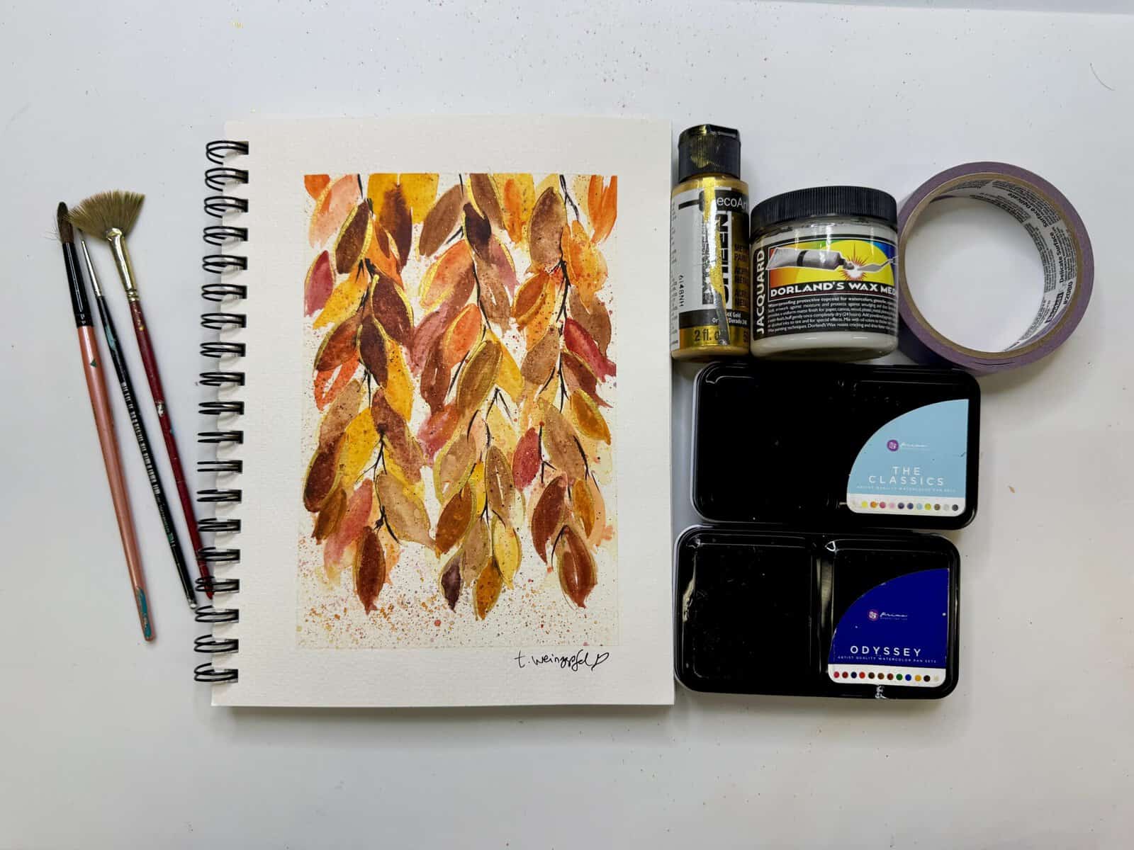
This little fall painting was such a wonderful reminder. You don’t need an entire afternoon or a perfectly organized studio to make something beautiful. Sometimes a few brushes, your favorite colors, and a little creative time are all you need. I hope this project inspires you to pull out your watercolors, embrace the beautiful colors of autumn, and give yourself permission to experiment.
Watch the replay below!
Thank you for joining in on the creative fun. Join us LIVE every Wednesday at 5:30 pm PST on Facebook at Tracy Weinzapfel Studios.
Join the waitlist for Your Artful Journey! This is my exclusive creative membership where you can explore the world of art journaling! Join a community of support and inspiration with interactive art sessions full of tips and tricks, conversation, Q & As, and most of all, FUN!
Supply List:
- 7 X 10 Grumbacher Watercolor Journal
- Painter’s tape
- DecoArt Extreme Sheet: 24K Gold
- Watercolors: The Classics and Odyssey
- Sealer: Dorland’s Wax
- Dynasty Brushes — small round brush and fine liner or detail brush. Tracy Weinzapfel Brush Set 2
Check out Tracy’s Art Journal Starter Kit!
Tracy’s Resources Page and visit Tracy’s Shop